If you’re creating video, thumbnails are one of the most important elements to consider. And in some creator’s opinions, equally as important as the actual content of your video.
But what actually makes a great, engaging video thumbnail? While there’s no one-size-fits-all answer and best practices will vary depending on your content niche, there are a few essential things to keep in mind when you’re designing them.
In this post, we’ll cover 5 essential tips based on advice from content creators, marketers, and video experts to help you create video thumbnails that get clicks. Let’s jump in.
Table of contents
1. Keep your design simple and focused
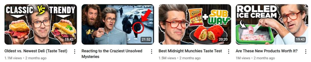
When someone is scrolling or browsing on YouTube, your thumbnail only has a few seconds (if that) to make an impression. And in most cases, your thumbnail image will be relatively small. That’s why it’s important to keep your thumbnail design simple and avoid small, hard-to-see elements.
Isaac Carlton, YouTuber and content creator, agrees. “A good thumbnail is simple and speaks for itself. Almost so clear that the video doesn’t even need a title,” he explains. “It’s easy to make thumbnails too cluttered and messy.” A thumbnail that has too much going on will likely only overwhelm and confuse anyone who looks at it, which won’t be effective for driving clicks.
We regularly test thumbnails for Storyblocks’ videos, and we’ve seen the same results first hand. “It seems from our conclusive tests that 1 large image that fills the entire screen and has a clear/interesting focal point works better than multiple, smaller images,” says Ali Tomek, Lead Visual Designer here at Storyblocks. Regular testing is key to finding out what works – see more in tip #5.
Key takeaway: Use one dominant subject, minimal text, and a strong focal point to keep your design simple.
2. Make it clear what your video is about
While this one might seem straightforward, you’d be surprised by how often people will choose more clickbait-y thumbnails. But while you might get more clicks initially, viewers don’t like being misled. They’ll quickly stop watching and drop off of your video once they realize that the video isn’t matching what they were expecting.
“Don’t optimize for clickbait, but a design that most accurately describes what your video is about,” says Kyle Miller, Manager of Video Production at Storyblocks. A thumbnail that tells your audience up front what the video is about is what will draw in the right viewers who are more likely to watch your video all the way through. And watch time (aka retention) is what YouTube cares about most, no matter how long your video is.
“Great thumbnails don’t just get viewers to click. They also help viewers understand what the video is about, so they can make informed decisions about what to watch.” – YouTube’s Official Guidance
So if your video is about your latest vacation to London, choosing a random frame isn’t going to cut it. Instead, choose an iconic landmark as your image like Big Ben, add in your face, and include text that says something like “5 days in London.” That way, it’s clear what the video is about and your followers can recognize your face to know it’s one of your videos.
You can also use visual storytelling to enhance your thumbnail by including things like reaction shots, intriguing scenes, or emotions. Going back to our last example, let’s say you were surprised by what attraction you liked the best in London. To focus on that for your thumbnail, you could include a photo of your face looking shocked (potentially pulled from a frame of your video), with the background being an image of that attraction, and text that says something like, “THIS was my favorite part of London?!”
That being said, I would only take the second approach if that’s the main focus of your video. Don’t leave the reveal for the last few minutes or make people sit through 10 minutes of other content, because then it’s more likely that people will click away and stop watching. You always want to deliver on what your thumbnail is promising sooner rather than later.
Key takeaway: Your thumbnail should visually summarize your video so viewers know what to expect, and they’ll be more likely to watch it all the way through.
3. Use text wisely
Text isn’t necessary for a thumbnail, but used correctly, it should help add clarity and complement your video title. At a baseline, any text you include in your design should be easy to read and high-contrast from the background. Usually, bolder is better for legibility on smaller screens and thumbnail sizes, but you can always run tests to see what works for your videos (see tip #5).
There are a lot of thumbnails that have text that are the same as their title. And while that can work, you should take advantage of the opportunity to expand on your title or add to it. “Ensure the copy on your thumbnail is different from your title,” Jade Beason, Creator and Marketing Consultant, emphasizes. “Think of thumbnails as advertisements for your videos!”
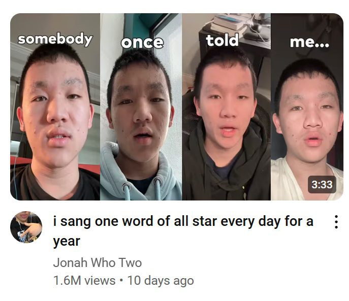
Creating curiosity gaps
One way that you can use the text of your thumbnail is to build a curiosity gap for your audience. A curiosity gap is a well-known marketing technique that teases the reader into wanting to know more about something. You can also see used in things like email subject lines, article titles, and more.
With a subject line, it could be something as simple as “Open me to get your exclusive discount code,” or “This one ingredient is what will take your cookies from good to great.” It makes you want to know more or take action for something.
You might be thinking that this seems similar to clickbait, which we said wasn’t a good idea earlier–and it is, but with one key difference. Curiosity gaps actually deliver and leave you satisfied, while clickbait leaves you feeling annoyed or dissatisfied.
Take the first subject line example with the discount code, for example. If you open the email and see your discount code in the email, that’s delivering on the curiosity gap that it created. You opened the email, and voila! The discount code. But if you open the email and it tells you that you have to go to a website to get the code or fill out a form? That’s clickbait. Because you expected to be able to get the code right away, not have to go through more steps, which is annoying.
So, how can you you use curiosity gaps with thumbnail text for your videos? One great way is to play into emotions.
In the example on the left below, you can see that the video is about adopting a dog from a high-kill shelter from the title. That alone is already tugging on the heartstrings of animal lovers. But on the thumbnail, the text “I did not expect this” makes you curious – what didn’t she expect? Paired with the image, you can make an educated guess that she didn’t expect to love the dog as much as she does. And who doesn’t love a happy adoption story?

In the second example on the right, you can see another curiosity gap with the thumbnail text. This one builds off of the title of the video, and also promises you something. What does the “best ever chicken coop” look like? That creates the curiosity. But the fact that it calls out that it’s a full tour means that you know it’s delivering on that curiosity and then some.
Key takeaway: Keep your thumbnail text short and use it to build off of your title, creating a curiosity gap that makes people want to know more.
4. Keep your branding consistent
Whether you’re a business or a content creator, your thumbnails are an important part of your channel’s branding. And when it comes to branding, consistency is key. By keeping a consistent color scheme, font, layout, etc., your viewers learn to recognize your thumbnails and get familiar with your specific branding.
“I definitely like to keep a consistent style, using all the same fonts on my thumbnails, and I color grade them all with the same Lightroom preset,” says Katie Steckly, a content creator. “I want people to see my thumbnails and immediately know that it’s one of my videos.” And Isaac Carlton agrees. “I only make thumbnails that have my face in it. I want to build familiarity with the audience above all,” he explains.
On our own YouTube channel, we follow that same principle. As a company, we have brand guidelines that we need to follow for our visual designs so that all of our content, from social media posts to emails and more, is easily recognizable. But since we have a branded color palette, we can choose different colors to be able to switch things up and make sure things aren’t too similar.
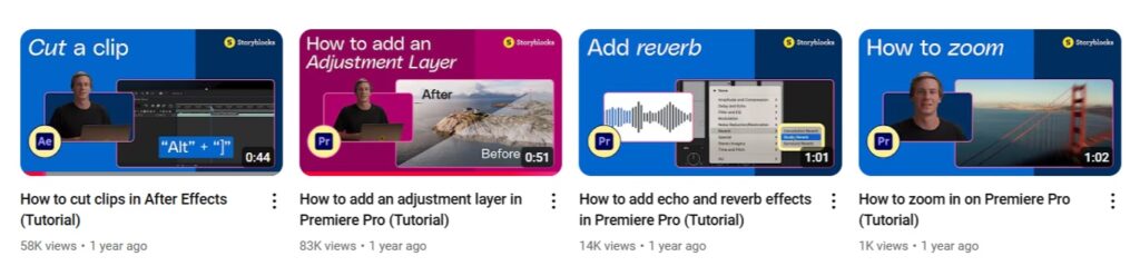
Key takeaway: Keep a signature look for your thumbnails that your audience can recognize, with consistent brand elements like color, fonts, layouts, etc.
That being said, too much consistency can make it so your thumbnails all end up looking very, very similar. Which means that people may not be able to tell them apart. And your viewers might assume from a quick glance that they’ve already seen the video before. Which leads us to our last and final tip.
5. Always test your thumbnails
As we’ve already mentioned twice in this article, testing is key to learning what works best for your thumbnails. Yes, all the other tips we’ve mentioned are important. But ultimately, testing is where you really learn the most about what your audience likes and what gets the most clicks for your content.
Even if your thumbnails are great and you’re seeing good engagement, there’s always room for improvement through testing different designs. And to make it even easier, YouTube now has a built-in testing system for thumbnails. It allows you to upload three different thumbnail variations, then tells you the winner based on watch time share. “YouTube’s new A/B/C test feature is fantastic, and once the test is complete, I typically work on more variations of the winning thumbnail,” says Isaac.
All of the different elements we’ve already mentioned in this article are perfect for testing. Try out different colors, text lengths, compositions, text size, using an image with your face vs one without. The options are endless. You can find even more inspiration and ideas for video tests here.
It’s important to keep things like your branding in mind when you’re running tests for your thumbnails. If your audience is used to your thumbnails looking a certain way, you should make gradual changes to see how they perform. Testing three different thumbnails that each have different compositions, fonts, colors, and other elements won’t tell you as much as smaller changes to your usual style will.
Key takeaway: Regularly test out 2-3 versions of your thumbnail through YouTube’s A/B testing feature to keep on learning what your audience likes and improving on your designs.
Your thumbnail is your video’s first impression – so make it a good one
If your thumbnail design for your video has been low priority or the last step in your creative process, it’s time to change that. Just like a movie poster or advertisement, your thumbnail is a crucial first step in attracting viewers.
By keeping your design focused, using text wisely, making it clear what your video is about, having consistent branding, and regularly testing, you should start to see better engagement.
Ready to level up your YouTube channel? With a Storyblocks subscription, you can get unlimited downloads of over 8 million royalty free stock assets to help you design better thumbnails and speed up your editing workflow. From 4K and HD footage to high-quality images, music, and more, everything you need is included in one affordable subscription plan. Sign up today to get started!